
The Biggest Mistakes Ranch Websites Make (And How to Fix Them)
Let’s be honest.
Most ranch websites weren’t built with strategy.
They were built once… usually by a nephew, a friend, or someone who “knows computers.”
And then they were left there even if it is a website dated 2012.
If you run a ranch or agricultural business, your website doesn’t need to be fancy.
But it does need to work.
Here are the biggest mistakes ranch websites make and why they quietly cost you clients.
1. No Clear Message on the Homepage
When someone lands on your ranch website, they should instantly know:
What you do
What you sell
Where you’re located
Instead, many sites open with:
“Welcome to our website.” That tells people nothing. Your homepage should clearly say something like: Family-Owned Cattle Ranch in Texas Specializing in Registered Angus Breeding Stock
Clear beats clever every time.
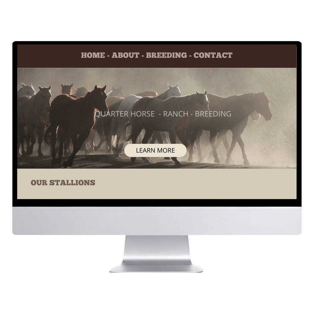
Outdated Design That Feels Abandoned
If your website looks like it was built in 2012, visitors notice.
Old fonts.
Tiny photos.
Cluttered layouts.
It doesn’t just look “old.”
It signals that the business may not be active.
In ranching, reputation matters. The brand and the visuals of your website matters. Your website should reflect that you’re established, organized, and professional.
3. Not Mobile-Friendly
Here’s reality:
People are checking your ranch website from:
Their truck
The barn
A sale
Their phone at night
If your website isn’t mobile-friendly, they might leave your website because they need to zoom in with their phone. Google also ranks mobile-friendly ranch websites higher. So this one affects SEO directly.
4.No Clear Call to Action
What do you want visitors to do?
Call you?
Request breeding info?
Book a visit?
Inquire about horses for sale?
Many ranch websites just… exist.
A professional ranch website guides visitors clearly:
“Request Availability”
“Inquire About Our Program”
“Contact Us”
It’s easier than ever to add an inquiry form directly on a page so buyers can send their questions and you receive the email instantly when the form is submitted. No back and forth. No confusion.
Here are a few simple calls to action you can add right now:
“Inquire About This Horse” (right under each sale listing)
“Request Breeding Information” (on your stallion page)
“Schedule a Ranch Visit” (for serious buyers)
“Join Our Sale List” (to build your email list)
Clear buttons. Clear direction.
5. Relying Only on Facebook
This one’s common. Many ranchers say: “We just use Facebook.” The problem? You don’t own Facebook.
Posts get buried and usually it’s only 2-5 % of our audience that see’s our posts! Crazy right?
On Facebook, information is not well structured. Visitors has to search for your services, your offers.
And serious buyers often Google you first.
A ranch business website builds credibility that social media alone can’t.
7. Poor or Missing Photography
In ranching and equine businesses, visuals are everything.
Buyers want to see:
Your land
Your livestock
Your facilities
Your horses
How you work or the atmosphere it is at your ranch
Dark, blurry, or outdated photos lower trust instantly. I once visited a stallion’s website where the photos were cropped so poorly you couldn’t even see his full body. For a breeding program, that’s a missed opportunity and an easy fix.
Sometimes it’s not about changing everything. It’s simply about having strong, well-framed photography and someone who understands how to present it properly on a website.
You don’t need a magazine-style photoshoot. But you do need clean, intentional visuals that showcase your animals and your operation with pride.
A ranch website doesn’t need to be flashy.
It needs to be:
Clear
Professional
Mobile-friendly
Easy to navigate
Built with basic SEO
Your website should work as hard as you do.